Hello there. I hope that all is going great with you. In this post, you will learn how to create a Toggle Button using HTML, CSS, and JavaScript. I recently designed an adorable shape Toggle Button that you may find appealing; today’s button is simple yet effective.
Toggle buttons can be added to any webpage or application to enable or disable specific aspects. For instance, to turn on Wi-Fi, you would use this type of button. They are helpful on various pages in software programs and other front-end components for similar purposes.
Please look at the image of our toggle button I posted online. As shown, one toggle button is closed while its counterpart opens up, but in reality, there is only one toggle button that we must click to open or close; only its circular part moves.
I believe you can quickly design this toggle button using HTML, CSS, and JavaScript. If you’re having difficulty creating an easy toggle switch, here is the complete source code;

Check out this:

Hamburger Menu Button that Has Loading Animation

Switch Button [Source Code] and Toggle Button (Source Code).

To create an animated Button using HTML, CSS, and JavaScript code, it’s necessary to create two separate files—one HTML and the other CSS. Once these have been made, copy-paste their contents into your document before downloading them in their entirety by clicking the Download Button.

<!DOCTYPE html>
    <html lang="en">
    <head>
        <meta charset="UTF-8">
        <meta http-equiv="X-UA-Compatible" content="IE=edge">
        <meta name="viewport" content="width=device-width, initial-scale=1.0">
       <title>Toggle Button Animation</title>
        <!-- CSS -->
        <link rel="stylesheet" href="css/style.css">
    </head>
    <body>
        <div></div>
        <!-- JavaScript -->
        <script>
            const toggleBtn = document.querySelector(".toggle");
            toggleBtn.addEventListener("click", () => toggleBtn.classList.toggle("active"));
        </script>
    </body>
</html>


*{
  margin: 0;
  padding: 0;
  box-sizing: border-box;
}
body{
  height: 100vh;
  display: flex;
  align-items: center;
  justify-content: center;
  background: #7d2ae8;
}
.toggle{
  position: relative;
  height: 12px;
  width: 125px;
  cursor: pointer;
  border-radius: 25px;
  background-color: #fff;
  box-shadow: 0 5px 10px rgba(0, 0, 0, 0.1);
}
.toggle::before{
  content: "";
  position: absolute;
  left: 0;
  top: 50%;
  transform: translateY(-50%);
  height: 50px;
  width: 50px;
  border-radius: 50%;
  background-color: #7d2ae8;
  border: 10px solid #fff;
  transition: all 0.5s cubic-bezier(0.68, -0.55, 0.265, 1.55);
  box-shadow: 0 5px 10px rgba(0, 0, 0, 0.1);
}
.toggle.active::before{
  left: calc(100% - 70px);
  background-color: #fff;
  border-color: #7d2ae8;
}

Assembling a button-click animation using HTML, CSS, and JavaScript can be both challenging and rewarding – it provides the perfect opportunity to broaden your skills in animation while producing something to share with others.

Button-click animation can be defined as any form of animation activated when someone presses a button on a web page or web app, typically as soon as the individual has pressed that button. These animations may take many forms, such as changing color or size or creating rippled effects, giving additional engagement to websites or applications online.

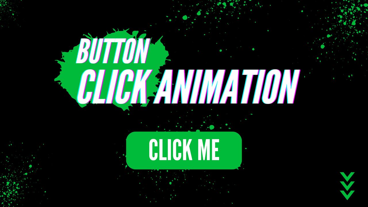
In this tutorial on this blog, you will learn how to make a button-click animation using HTML, CSS, and JavaScript! After this course, you will have created a button that animates when clicked, producing tiny bubbles, as seen in the picture. Recently, I developed a Chrome Extension, so this project can prove beneficial.

Steps for Creating an Animation Button: Click Animation

Let us show you how to create the Button Click Animation using HTML, CSS, and JavaScript in just two steps:

  • File Outline of Project Structure and Contents
  • Design of Button Click Animations

1. Project File Outline and Contents of Project

To create this animation, two files will be required—index. html and style. CSS contains all the HTML, CSS, and JavaScript codes necessary to build button animation. Let’s create these two files before beginning to add code to them.

Once your files are complete, the next step in creating your Button Click Animation is taking shape.

2. Design of Button Click Animations

At this stage, we’ll design the user interface of our button using HTML and CSS. Once completed, JavaScript can be utilized to animate it when clicked upon.

You can add HTML and JavaScript code to the index.html file to create the framework of an animated button.

<!DOCTYPE html>
<!-- Coding By abgiri- abgiri.com -->
<html lang="en">
  <head>
    <meta charset="UTF-8" />
    <meta http-equiv="X-UA-Compatible" content="IE=edge" />
    <meta name="viewport" content="width=device-width, initial-scale=1.0" />
   <title>Button Click Animation</title>
    <link rel="stylesheet" href="style.css" />
  </head>
  <body>
    <button>Click Me</button>
    <script>
      const button = document.querySelector(".button");
      button.addEventListener("click", (e) => {
        e.preventDefault;
        button.classList.add("animate");
        setTimeout(() => {
          button.classList.remove("animate");
        }, 600);
      });
    </script>
  </body>
</html>

Within your style.css file, you can include this CSS code to add styles and create buttons and bubbles. If you would like to change their background color, size, font style, etc., simply modify this code accordingly!

/* Import Google font - Poppins */
@import url("https://fonts.googleapis.com/css2?family=Poppins:wght@200;300;400;500;600;700&display=swap");
* {
  margin: 0;
  padding: 0;
  box-sizing: border-box;
  font-family: "Poppins", sans-serif;
}
body {
  display: flex;
  height: 100vh;
  display: flex;
  align-items: center;
  justify-content: center;
  background-color: #f0faff;
}
.button {
  position: relative;
  padding: 10px 22px;
  border-radius: 6px;
  border: none;
  color: #fff;
  cursor: pointer;
  background-color: #7d2ae8;
  transition: all 0.2s ease;
}
.button:active {
  transform: scale(0.96);
}
.button:before,
.button:after {
  position: absolute;
  content: "";
  width: 150%;
  left: 50%;
  height: 100%;
  transform: translateX(-50%);
  z-index: -1000;
  background-repeat: no-repeat;
}
.button.animate::before {
  top: -70%;
  background-image: radial-gradient(circle, #7d2ae8 20%, transparent 20%),
    radial-gradient(circle, transparent 20%, #7d2ae8 20%, transparent 30%),
    radial-gradient(circle, #7d2ae8 20%, transparent 20%),
    radial-gradient(circle, #7d2ae8 20%, transparent 20%),
    radial-gradient(circle, transparent 10%, #7d2ae8 15%, transparent 20%),
    radial-gradient(circle, #7d2ae8 20%, transparent 20%),
    radial-gradient(circle, #7d2ae8 20%, transparent 20%),
    radial-gradient(circle, #7d2ae8 20%, transparent 20%),
    radial-gradient(circle, #7d2ae8 20%, transparent 20%);
  background-size: 10% 10%, 20% 20%, 15% 15%, 20% 20%, 18% 18%, 10% 10%, 15% 15%,
    10% 10%, 18% 18%;
  animation: greentopBubbles ease-in-out 0.6s forwards infinite;
}
@keyframes greentopBubbles {
  0% {
    background-position: 5% 90%, 10% 90%, 10% 90%, 15% 90%, 25% 90%, 25% 90%,
      40% 90%, 55% 90%, 70% 90%;
  }
  50% {
    background-position: 0% 80%, 0% 20%, 10% 40%, 20% 0%, 30% 30%, 22% 50%,
      50% 50%, 65% 20%, 90% 30%;
  }
  100% {
    background-position: 0% 70%, 0% 10%, 10% 30%, 20% -10%, 30% 20%, 22% 40%,
      50% 40%, 65% 10%, 90% 20%;
    background-size: 0% 0%, 0% 0%, 0% 0%, 0% 0%, 0% 0%, 0% 0%;
  }
}
.button.animate::after {
  bottom: -70%;
  background-image: radial-gradient(circle, #7d2ae8 20%, transparent 20%),
    radial-gradient(circle, #7d2ae8 20%, transparent 20%),
    radial-gradient(circle, transparent 10%, #7d2ae8 15%, transparent 20%),
    radial-gradient(circle, #7d2ae8 20%, transparent 20%),
    radial-gradient(circle, #7d2ae8 20%, transparent 20%),
    radial-gradient(circle, #7d2ae8 20%, transparent 20%),
    radial-gradient(circle, #7d2ae8 20%, transparent 20%);
  background-size: 15% 15%, 20% 20%, 18% 18%, 20% 20%, 15% 15%, 20% 20%, 18% 18%;
  animation: greenbottomBubbles ease-in-out 0.6s forwards infinite;
}
@keyframes greenbottomBubbles {
  0% {
    background-position: 10% -10%, 30% 10%, 55% -10%, 70% -10%, 85% -10%,
      70% -10%, 70% 0%;
  }
  50% {
    background-position: 0% 80%, 20% 80%, 45% 60%, 60% 100%, 75% 70%, 95% 60%,
      105% 0%;
  }
  100% {
    background-position: 0% 90%, 20% 90%, 45% 70%, 60% 110%, 75% 80%, 95% 70%,
      110% 10%;
    background-size: 0% 0%, 0% 0%, 0% 0%, 0% 0%, 0% 0%, 0% 0%;
  }
}

Conclusion and Final Words

By following these steps, you have successfully created the button-click animation. Various animations are available here on this site to help you further hone your animation skills.

If this blog has benefited you, please share it with others. Your assistance helps us continue creating valuable tools and content for the developer community—we appreciate it greatly! Thank you so much for giving back!

Dear Readers, In this blog, you’ll learn how to send mail through the XAMPP server. Previously, I shared my thoughts on setting up XAMPP to send mail via Localhost within PHP; if you haven’t yet posted, please make time to do so first.
At this particular web page program, there is a form for sending mail that requires three inputs: email address, subject, and message. If you click send without filling out all three fields (subject, message, and recipient address fields), an alert stating: All input fields are required! It will appear before clicking send again; after filling in and sending, your message will arrive to its recipient using delivery from an address field that was completed and receiving an acknowledgment message that reads: Your mail was successfully delivered”.
If the mail cannot be delivered successfully, an alert message with “Sorry, failed while sending mail!” will appear. If this explanation does not make sense, check out my comprehensive video tutorial [How to Send Email with PHP and Gmail>>] instead.

You may like these:

How to Send Email using PHP and Gmail [Source Codes]

To create this program, [how to send Email with PHP and Gmail], first create two files, one PHP File and the other CSS File, then add this code into one or both files.
First, create a PHP file named mail.html and copy and paste the codes from here into it. Please keep in mind that all PHP files must include the .php extension for proper functioning.

<!DOCTYPE html>
<html lang="en">
   <head>
      <meta charset="UTF-8">
      <title>Send Mail From Localhost</title>
      <link rel="stylesheet" href="style.css">
      <!-- bootstrap cdn link -->
      <link rel="stylesheet" href="https://stackpath.bootstrapcdn.com/bootstrap/4.5.2/css/bootstrap.min.css">
   </head>
   <body>
      <div>
         <div>
            <div>
               <h2>
                  Send Message
               </h2>
               <p>
                  Send mail to anyone from localhost.
               </p>
               <!-- starting php code -->
               <?php
                  //first we leave this input field blank
                  $recipient = "";
                  //if user click the send button
                  if(isset($_POST['send'])){
                      //access user entered data
                     $recipient = $_POST['email'];
                     $subject = $_POST['subject'];
                     $message = $_POST['message'];
                     $sender = "From: [email protected]";
                     //if user leave empty field among one of them
                     if(empty($recipient) || empty($subject) || empty($message)){
                         ?>
               <!-- display an alert message if one of them field is empty -->
               <div>
                  <?php echo "All inputs are required!" ?>
               </div>
               <?php
                  }else{
                      // PHP function to send mail
                     if(mail($recipient, $subject, $message, $sender)){
                      ?>
               <!-- display a success message if once mail sent sucessfully -->
               <div>
                  <?php echo "Your mail successfully sent to $recipient"?>
               </div>
               <?php
                  $recipient = "";
                  }else{
                   ?>
               <!-- display an alert message if somehow mail can't be sent -->
               <div>
                  <?php echo "Failed while sending your mail!" ?>
               </div>
               <?php
                  }
                  }
                  }
                  ?> <!-- end of php code -->
               <form action="mail.php" method="POST">
                  <div>
                     <input name="email" type="email" placeholder="Recipients" value="<?php echo $recipient ?>">
                  </div>
                  <div>
                     <input name="subject" type="text" placeholder="Subject">
                  </div>
                  <div>
                     <!-- change this tag name into textarea to show textarea field. Due to more textarea I got an error, so I change the name of this field -->
                     <!-- <changeit cols="30" rows="5" name="message" placeholder="Compose your message.."></changeit> -->
                  </div>
                  <div>
                     <input type="submit" name="send" value="Send" placeholder="Subject">
                  </div>
               </form>
            </div>
         </div>
      </div>
   </body>
</html>

Create the CSS file style.css and copy and paste your codes directly into it. Ensure it ends with an a.css extension for ease of later access.

/* custom css styling */
@import url('https://fonts.googleapis.com/css?family=Poppins:400,500,600,700&display=swap');
html,body{
    background: #007bff;
}
::selection{
    color: #fff;
    background: #007bff;
}
.container{
    position: absolute;
    top: 50%;
    left: 50%;
    transform: translate(-50%, -50%);
    font-family: 'Poppins', sans-serif;
}
.container .mail-form{
    background: #fff;
    padding: 25px 35px;
    border-radius: 5px;
    box-shadow: 0 4px 8px 0 rgba(0, 0, 0, 0.2), 
                0 6px 20px 0 rgba(0, 0, 0, 0.19);
}
.container form .form-control{
    height: 43px;
    font-size: 15px;
}
.container .mail-form form .form-group .button{
    font-size: 17px!important;
}
.container form .textarea{
    height: 100px;
    resize: none;
}
.container .mail-form h2{
    font-size: 30px;
    font-weight: 600;
}
.container .mail-form p{
    font-size: 14px;
}

Have a successful How to send mail using XAMPP Server and PHP experience! Suppose the code doesn’t work as expected or there are any issues with the files created by clicking the download link. In that case, it is entirely free and immediately available as .zip downloads that you can extract yourself!

Enhance your web development skills by embarking on a practical journey of creating a Fiverr site using HTML and CSS. This tutorial not only allows you to recreate designs from popular platforms like Fiverr but also empowers you to showcase your ability to recreate existing designs.
This blog post presents a straightforward guide on how to build a responsive Fiverr website using only HTML, CSS, and JavaScript. You will confidently learn how to create an interactive homepage featuring navigation bars and place elements on the page with styles matching Fiverr’s.
As we create our Fiverr-inspired homepage, we will explore a range of HTML tags and CSS attributes, such as navigation bars, sections, divs, inputs, links, and others, to craft an appealing layout and ensure an accessible interface.

How to Create a Fiverr Website Using HTML and CSS

  • Follow these instructions to create a responsive Fiverr-inspired Homepage using HTML and CSS:
  • Create a folder, name it, and place all necessary files inside.
  • Create an index.html file as your starting point.
  • Create a style.css file containing CSS code.
  • The Images folder can be downloaded and placed into the project directory for use during development. It includes files for both the Fiverr Logo and Hero Background Image.

Add the HTML codes below to your index.html file for use on mobile screens. These codes provide navigation bars, sections, input fields, and links, in addition to various tags that make up your website. These codes include JavaScript lines for toggling menus on and off.

<!DOCTYPE html>
<html lang="en">
<head>
  <meta charset="UTF-8">
  <meta name="viewport" content="width=device-width, initial-scale=1.0">
  <title>Fiverr Homepage Clone</title>
  <link rel="stylesheet" href="style.css">
  <!-- Google Icons Link -->
  <link rel="stylesheet" href="https://fonts.googleapis.com/css2?family=Material+Symbols+Outlined:opsz,wght,FILL,GRAD@48,400,0,0">
</head>
<body>
  <header>
    <nav>
      <a href="#">
        <img src="images/logo.svg" alt="Fiverr Logo">
      </a>
      <ul>
        <li><a href="#">Fiverr Business</a></li>
        <li><a href="#">Explore</a></li>
        <li>
          <a href="#">
            <span>language</span>
            English
          </a>
        </li>
        <li><a href="#">Become a Seller</a></li>
        <li><a href="#">Sign In</a></li>
        <li><a href="#">Join Us</a></li>
        <span id="close-menu-btn">close</span>
      </ul>
      <span id="hamburger-btn">menu</span>
    </nav>
  </header>
  <section>
    <div>
      <h1>Find the right freelance service, right away</h1>
      <form action="#">
        <input type="text" placeholder="Search for any service..." required>
        <button type="sumbit">search</button>
      </form>
      <div>
        Popular:
        <ul>
          <li><a href="#">Webite Design</a></li>
          <li><a href="#">Logo Design</a></li>
          <li><a href="#">WordPress</a></li>
          <li><a href="#">AI Design</a></li>
        </ul>
      </div>
    </div>
  </section>
  <script>
    const header = document.querySelector("header");
    const hamburgerBtn = document.querySelector("#hamburger-btn");
    const closeMenuBtn = document.querySelector("#close-menu-btn");
    // Toggle mobile menu on hamburger button click
    hamburgerBtn.addEventListener("click", () => header.classList.toggle("show-mobile-menu"));
    // Close mobile menu on close button click
    closeMenuBtn.addEventListener("click", () => hamburgerBtn.click());
  </script>
</body>
</html>

Add the CSS codes below to your style.css to replicate the Fiverr Homepage look on your website. These CSS codes feature styles for elements such as color, border, background, and even the image from Fiverr! Additionally, media queries make your website responsive.

/* Importing Google font - Fira Sans */
@import url('https://fonts.googleapis.com/css2?family=Fira+Sans:wght@300;400;500;600;700&display=swap');
* {
  margin: 0;
  padding: 0;
  box-sizing: border-box;
  font-family: 'Fira Sans', sans-serif;
}
body {
  background: #1B1B1D;
}
header {
  position: fixed;
  left: 0;
  top: 0;
  width: 100%;
  z-index: 1;
  padding: 20px;
}
header .navbar {
  max-width: 1280px;
  margin: 0 auto;
  display: flex;
  align-items: center;
  justify-content: space-between;
}
.navbar .menu-links {
  display: flex;
  align-items: center;
  list-style: none;
  gap: 30px;
}
.navbar .menu-links li a {
  color: #fff;
  font-weight: 500;
  text-decoration: none;
  transition: 0.2s ease;
}
.navbar .menu-links .language-item a {
  display: flex;
  gap: 8px;
  align-items: center;
}
.navbar .menu-links .language-item span {
  font-size: 1.3rem;
}
.navbar .menu-links li a:hover {
  color: #1dbf73;
}
.navbar .menu-links .join-btn a {
  border: 1px solid #fff;
  padding: 8px 15px;
  border-radius: 4px;
}
.navbar .menu-links .join-btn a:hover {
  color: #fff;
  border-color: transparent;
  background: #1dbf73;
}
.hero-section {
  height: 100vh;
  background-image: url("images/hero-img.jpg");
  background-position: center;
  background-size: cover;
  position: relative;
  display: flex;
  padding: 0 20px;
  align-items: center;
}
.hero-section .content {
  max-width: 1280px;
  margin: 0 auto 40px;
  width: 100%;
}
.hero-section .content h1 {
  color: #fff;
  font-size: 3rem;
  max-width: 630px;
  line-height: 65px;
}
.hero-section .search-form {
  height: 48px;
  display: flex;
  max-width: 630px;
  margin-top: 30px;
}
.hero-section .search-form input {
  height: 100%;
  width: 100%;
  border: none;
  outline: none;
  padding: 0 15px;
  font-size: 1rem;
  border-radius: 4px 0 0 4px;
}
.hero-section .search-form button {
  height: 100%;
  width: 60px;
  border: none;
  outline: none;
  cursor: pointer;
  background: #1dbf73;
  color: #fff;
  border-radius: 0 4px 4px 0;
  transition: background 0.2s ease;
}
.hero-section .search-form button:hover {
  background: #19a463;
}
.hero-section .popular-tags {
  display: flex;
  color: #fff;
  gap: 25px;
  font-size: 0.875rem;
  font-weight: 500;
  margin-top: 25px;
}
.hero-section .popular-tags .tags {
  display: flex;
  gap: 15px;
  align-items: center;
  list-style: none;
}
.hero-section .tags li a {
  text-decoration: none;
  color: #fff;
  border: 1px solid #fff;
  padding: 4px 12px;
  border-radius: 50px;
  transition: 0.2s ease;
}
.hero-section .tags li a:hover {
  color: #000;
  background: #fff;
}
.navbar #hamburger-btn {
  color: #fff;
  cursor: pointer;
  display: none;
  font-size: 1.7rem;
}
.navbar #close-menu-btn {
  position: absolute;
  display: none;
  color: #000;
  top: 20px;
  right: 20px;
  cursor: pointer;
  font-size: 1.7rem;
}
@media screen and (max-width: 900px) {
  header.show-mobile-menu::before {
    content: "";
    height: 100%;
    width: 100%;
    position: fixed;
    left: 0;
    top: 0;
    backdrop-filter: blur(5px);
  }
  .navbar .menu-links {
    height: 100vh;
    max-width: 300px;
    width: 100%;
    background: #fff;
    position: fixed;
    left: -300px;
    top: 0;
    display: block;
    padding: 75px 40px 0;
    transition: left 0.2s ease;
  }
  header.show-mobile-menu .navbar .menu-links {
    left: 0;
  }
  .navbar .menu-links li {
    margin-bottom: 30px;
  }
  .navbar .menu-links li a {
    color: #000;
    font-size: 1.1rem;
  }
  .navbar .menu-links .join-btn a {
    padding: 0;
  }
  .navbar .menu-links .join-btn a:hover {
    color: #1dbf73;
    background: none;
  }
  .navbar :is(#close-menu-btn, #hamburger-btn) {
    display: block;
  }
  .hero-section {
    background: none;
  }
  .hero-section .content {
    margin: 0 auto 80px;
  }
  .hero-section .content :is(h1, .search-form) {
    max-width: 100%;
  }
  .hero-section .content h1 {
    text-align: center;
    font-size: 2.5rem;
    line-height: 55px;
  }
  .hero-section .search-form {
    display: block;
    margin-top: 20px;
  }
  .hero-section .search-form input {
    border-radius: 4px;
  }
  .hero-section .search-form button {
    margin-top: 10px;
    border-radius: 4px;
    width: 100%;
  }
  .hero-section .popular-tags {
    display: none;
  }
}

You may like these:

Conclusion and final remarks.

Building a Fiverr website using HTML, CSS, and JavaScript can be an enjoyable project for new web programmers. You have created an engaging, responsive Fiverr homepage by following the instructions presented here!
Don’t stop here! Keep the inspiration flowing by continuing to experiment and hone your skills. I encourage you to explore and recreate other impressive website designs found here, and let your creativity soar.
Clicking the Download button will provide free access to this Fiverr Homepage’s source files should any issues arise when creating your Fiverr site. Alternatively, click View Live for a live demonstration.

Are You New to Web Development? Building a Website With Login and Registration Documents as PracticeIf you’re just getting into web development, developing a website complete with login and registration paperwork is an ideal way to assess and practice critical competencies such as creating navigation menu bars, developing homepage pages and writing login/registration documents.
I will walk you through creating a responsive website with login and registration forms using HTML, CSS, and JavaScript. By accomplishing this task, you’ll gain practical experience and learn essential web development principles such as DOM manipulation, event handling, conditional statements, etc.
In this task, the website’s homepage features a navigation bar and login button; when clicked, it will reveal an attractive blurred background login form with a picture on the left and input fields on the right side. If you wish to join instead, click the sign-up link, which will take you directly to the registration form.
The navigation bar and documents on this website are fully responsive, which means they will adapt to fit any display size. On smaller displays, for instance, when clicking on a hamburger button to bring up navigation bars, they will appear from the right side, and forms will remain hidden when the left image section remains hidden.
The above YouTube video can be an excellent learning resource if you prefer learning through video tutorials. I have explained each line of code and provided helpful insights that make creating your website with login/registration processes accessible and user-friendly for beginners.
However, if you prefer reading blog posts or need a step-by-step guide, continue reading this publication. By the time it ends, you’ll have created your internet website with forms that are easy to customize and implement for various projects.

Steps for Establishing a Website with Login & Registration Form

Follow these step-by-step instructions to create a responsive internet website featuring login and registration forms with HTML, CSS, and vanilla JavaScript:

  1. First, create a folder with any name you like and store the necessary files.
  2. Create an index.Html report as the main document.
  3. Create a report called style.Css to hold onto CSS code.
  4. Create a document named script.Js to house your JavaScript code.
  5. Download and add the Images folder to your project listing. This folder contains all of the images needed for this undertaking.

Start by uploading the following HTML codes to your index.Html file: header, nav, ul, form, and any extra elements needed for the project.

<!DOCTYPE html>
<html lang="en">
<head>
    <meta charset="UTF-8">
    <meta name="viewport" content="width=device-width, initial-scale=1.0">
    <title>Website with Login and Registration Form</title>
    <!-- Google Fonts Link For Icons -->
    <link rel="stylesheet" href="https://fonts.googleapis.com/css2?family=Material+Symbols+Rounded:opsz,wght,FILL,GRAD@48,400,0,0">
    <link rel="stylesheet" href="style.css">
    <script src="script.js" defer></script>
</head>
<body>
    <header>
        <nav>
            <span>menu</span>
            <a href="#">
                <img src="images/logo.jpg" alt="logo">
                <h2>CodingNepal</h2>
            </a>
            <ul>
                <span>close</span>
                <li><a href="#">Home</a></li>
                <li><a href="#">Portfolio</a></li>
                <li><a href="#">Courses</a></li>
                <li><a href="#">About us</a></li>
                <li><a href="#">Contact us</a></li>
            </ul>
            <button>LOG IN</button>
        </nav>
    </header>
    <div></div>
    <div>
        <span>close</span>
        <div>
            <div>
                <h2>Welcome Back</h2>
                <p>Please log in using your personal information to stay connected with us.</p>
            </div>
            <div>
                <h2>LOGIN</h2>
                <form action="#">
                    <div>
                        <input type="text" required>
                        <label>Email</label>
                    </div>
                    <div>
                        <input type="password" required>
                        <label>Password</label>
                    </div>
                    <a href="#">Forgot password?</a>
                    <button type="submit">Log In</button>
                </form>
                <div>
                    Don't have an account?
                    <a href="#" id="signup-link">Signup</a>
                </div>
            </div>
        </div>
        <div>
            <div>
                <h2>Create Account</h2>
                <p>To become a part of our community, please sign up using your personal information.</p>
            </div>
            <div>
                <h2>SIGNUP</h2>
                <form action="#">
                    <div>
                        <input type="text" required>
                        <label>Enter your email</label>
                    </div>
                    <div>
                        <input type="password" required>
                        <label>Create password</label>
                    </div>
                    <div>
                        <input type="checkbox" id="policy">
                        <label for="policy">
                            I agree the
                            <a href="#">Terms & Conditions</a>
                        </label>
                    </div>
                    <button type="submit">Sign Up</button>
                </form>
                <div>
                    Already have an account? 
                    <a href="#" id="login-link">Login</a>
                </div>
            </div>
        </div>
    </div>
</body>
</html>

 
Add these CSS codes to your style.css document for visual styling on your website and documents. Experiment with various CSS properties, such as colours, fonts, and backgrounds, for a truly customized feel on your site.
 

/* Importing Google font - Open Sans */
@import url("https://fonts.googleapis.com/css2?family=Open+Sans:wght@400;500;600;700&display=swap");
* {
    margin: 0;
    padding: 0;
    box-sizing: border-box;
    font-family: "Open Sans", sans-serif;
}
body {
    height: 100vh;
    width: 100%;
    background: url("images/hero-bg.jpg") center/cover no-repeat;
}
header {
    position: fixed;
    width: 100%;
    top: 0;
    left: 0;
    z-index: 10;
    padding: 0 10px;
}
.navbar {
    display: flex;
    padding: 22px 0;
    align-items: center;
    max-width: 1200px;
    margin: 0 auto;
    justify-content: space-between;
}
.navbar .hamburger-btn {
    display: none;
    color: #fff;
    cursor: pointer;
    font-size: 1.5rem;
}
.navbar .logo {
    gap: 10px;
    display: flex;
    align-items: center;
    text-decoration: none;
}
.navbar .logo img {
    width: 40px;
    border-radius: 50%;
}
.navbar .logo h2 {
    color: #fff;
    font-weight: 600;
    font-size: 1.7rem;
}
.navbar .links {
    display: flex;
    gap: 35px;
    list-style: none;
    align-items: center;
}
.navbar .close-btn {
    position: absolute;
    right: 20px;
    top: 20px;
    display: none;
    color: #000;
    cursor: pointer;
}
.navbar .links a {
    color: #fff;
    font-size: 1.1rem;
    font-weight: 500;
    text-decoration: none;
    transition: 0.1s ease;
}
.navbar .links a:hover {
    color: #19e8ff;
}
.navbar .login-btn {
    border: none;
    outline: none;
    background: #fff;
    color: #275360;
    font-size: 1rem;
    font-weight: 600;
    padding: 10px 18px;
    border-radius: 3px;
    cursor: pointer;
    transition: 0.15s ease;
}
.navbar .login-btn:hover {
    background: #ddd;
}
.form-popup {
    position: fixed;
    top: 50%;
    left: 50%;
    z-index: 10;
    width: 100%;
    opacity: 0;
    pointer-events: none;
    max-width: 720px;
    background: #fff;
    border: 2px solid #fff;
    transform: translate(-50%, -70%);
}
.show-popup .form-popup {
    opacity: 1;
    pointer-events: auto;
    transform: translate(-50%, -50%);
    transition: transform 0.3s ease, opacity 0.1s;
}
.form-popup .close-btn {
    position: absolute;
    top: 12px;
    right: 12px;
    color: #878484;
    cursor: pointer;
}
.blur-bg-overlay {
    position: fixed;
    top: 0;
    left: 0;
    z-index: 10;
    height: 100%;
    width: 100%;
    opacity: 0;
    pointer-events: none;
    backdrop-filter: blur(5px);
    -webkit-backdrop-filter: blur(5px);
    transition: 0.1s ease;
}
.show-popup .blur-bg-overlay {
    opacity: 1;
    pointer-events: auto;
}
.form-popup .form-box {
    display: flex;
}
.form-box .form-details {
    width: 100%;
    color: #fff;
    max-width: 330px;
    text-align: center;
    display: flex;
    flex-direction: column;
    justify-content: center;
    align-items: center;
}
.login .form-details {
    padding: 0 40px;
    background: url("images/login-img.jpg");
    background-position: center;
    background-size: cover;
}
.signup .form-details {
    padding: 0 20px;
    background: url("images/signup-img.jpg");
    background-position: center;
    background-size: cover;
}
.form-box .form-content {
    width: 100%;
    padding: 35px;
}
.form-box h2 {
    text-align: center;
    margin-bottom: 29px;
}
form .input-field {
    position: relative;
    height: 50px;
    width: 100%;
    margin-top: 20px;
}
.input-field input {
    height: 100%;
    width: 100%;
    background: none;
    outline: none;
    font-size: 0.95rem;
    padding: 0 15px;
    border: 1px solid #717171;
    border-radius: 3px;
}
.input-field input:focus {
    border: 1px solid #00bcd4;
}
.input-field label {
    position: absolute;
    top: 50%;
    left: 15px;
    transform: translateY(-50%);
    color: #4a4646;
    pointer-events: none;
    transition: 0.2s ease;
}
.input-field input:is(:focus, :valid) {
    padding: 16px 15px 0;
}
.input-field input:is(:focus, :valid)~label {
    transform: translateY(-120%);
    color: #00bcd4;
    font-size: 0.75rem;
}
.form-box a {
    color: #00bcd4;
    text-decoration: none;
}
.form-box a:hover {
    text-decoration: underline;
}
form :where(.forgot-pass-link, .policy-text) {
    display: inline-flex;
    margin-top: 13px;
    font-size: 0.95rem;
}
form button {
    width: 100%;
    color: #fff;
    border: none;
    outline: none;
    padding: 14px 0;
    font-size: 1rem;
    font-weight: 500;
    border-radius: 3px;
    cursor: pointer;
    margin: 25px 0;
    background: #00bcd4;
    transition: 0.2s ease;
}
form button:hover {
    background: #0097a7;
}
.form-content .bottom-link {
    text-align: center;
}
.form-popup .signup,
.form-popup.show-signup .login {
    display: none;
}
.form-popup.show-signup .signup {
    display: flex;
}
.signup .policy-text {
    display: flex;
    margin-top: 14px;
    align-items: center;
}
.signup .policy-text input {
    width: 14px;
    height: 14px;
    margin-right: 7px;
}
@media (max-width: 950px) {
    .navbar :is(.hamburger-btn, .close-btn) {
        display: block;
    }
    .navbar {
        padding: 15px 0;
    }
    .navbar .logo img {
        display: none;
    }
    .navbar .logo h2 {
        font-size: 1.4rem;
    }
    .navbar .links {
        position: fixed;
        top: 0;
        z-index: 10;
        left: -100%;
        display: block;
        height: 100vh;
        width: 100%;
        padding-top: 60px;
        text-align: center;
        background: #fff;
        transition: 0.2s ease;
    }
    .navbar .links.show-menu {
        left: 0;
    }
    .navbar .links a {
        display: inline-flex;
        margin: 20px 0;
        font-size: 1.2rem;
        color: #000;
    }
    .navbar .links a:hover {
        color: #00BCD4;
    }
    .navbar .login-btn {
        font-size: 0.9rem;
        padding: 7px 10px;
    }
}
@media (max-width: 760px) {
    .form-popup {
        width: 95%;
    }
    .form-box .form-details {
        display: none;
    }
    .form-box .form-content {
        padding: 30px 20px;
    }
}

Once the patterns have been applied, load the website in your browser to view your creation. While the forms may be hidden, they will become visible in JavaScript later. At present, only its navigation bar and hero image will be visible.
Add the following JavaScript code into your script.Js file: It includes click event listeners, allowing classes to be toggled on various HTML points. Although it’s easy to understand, it may help to watch the above video tutorial and review code feedback before performing experiments.

const navbarMenu = document.querySelector(".navbar .links");
const hamburgerBtn = document.querySelector(".hamburger-btn");
const hideMenuBtn = navbarMenu.querySelector(".close-btn");
const showPopupBtn = document.querySelector(".login-btn");
const formPopup = document.querySelector(".form-popup");
const hidePopupBtn = formPopup.querySelector(".close-btn");
const signupLoginLink = formPopup.querySelectorAll(".bottom-link a");
// Show mobile menu
hamburgerBtn.addEventListener("click", () => {
    navbarMenu.classList.toggle("show-menu");
});
// Hide mobile menu
hideMenuBtn.addEventListener("click", () =>  hamburgerBtn.click());
// Show login popup
showPopupBtn.addEventListener("click", () => {
    document.body.classList.toggle("show-popup");
});
// Hide login popup
hidePopupBtn.addEventListener("click", () => showPopupBtn.click());
// Show or hide signup form
signupLoginLink.forEach(link => {
    link.addEventListener("click", (e) => {
        e.preventDefault();
        formPopup.classList[link.id === 'signup-link' ? 'add' : 'remove']("show-signup");
    });
});

Conclusion and Final Phrases.

Making a website’s homepage with paperwork is an engaging, hands-on learning experience for exploring various website components and general web development principles. By following the steps outlined in this blog post, I believe you have successfully created your own login/registration website using HTML, CSS, and JavaScript technologies.
As part of your efforts to further your web development skills, recreating some of the websites and login form projects offered on this website will give you a deeper understanding of how HTML, CSS and JavaScript work together to produce distinctive website elements.
If you encounter difficulties building your website with forms, you can download the source code files free of charge by clicking the Download button and viewing a live demo by pressing View Live.

Hello friend! I hope your project is progressing well, and I look forward to meeting and making memories with you soon! This weblog post will teach you to create a responsive Testimonial Slider using HTML/CSS and SwiperJs/JavaScript/SwiperJS. I have also made numerous sliding cards using HTML/CSS or combining both techniques!

Testimonials are reviews of products and offerings. For instance, testimonials on a coffee shop website may include reviews where various customers leave opinions about said coffee shop’s coffee.

Please glance at our project [Testimonial Slider]; you can easily spot an image and review the text of an individual on a product or service at the bottom. There is also a quote icon and their name/process at the right and left sides, with three-dot buttons showing that it can be slideable when we click either right or left on the nav button to move right or left, and another person’s quote will be revealed; you may even grab and slide mouse right or left to change between content material slideshow modes!

Let’s watch a demo of this testimonial and all the HTML, CSS, and JavaScript code used to build this mission [Testimonial Slider].

As promised, I have enclosed all the HTML, CSS and JavaScript code used to build this Testimonial Slider. However, before going further into its code file, allow me to describe its academic context briefly.

As seen within the video tutorial of [Testimonial Slider], there is a wase containing several testimonial textual content, including its name and jot of character. At the bottom of that testimonial content, there were three dots, and on both the right and left sides, there were navigation buttons; when I clicked the right side button, it slid right-side until proper-side content appeared, whereas grabbing and shifting my mouse right or left would cause it to slide left or right respectively.

We realized our testimonial had become completely responsive; when I reduced its width, it perfectly fit onto the display screen. Once our testimonial width reached tablet screen sizes, its nav button disappeared since we could slide it with our fingers.

Now, I hope you can post this testimonial using HTML, CSS, JavaScript, and SwiperJs. If you encounter difficulty creating it yourself, please use my source code below as a starting point.

Testimonial Slider [Source Code]

To generate HTML, CSS, and JavaScript code for a Testimonial Slider, three files must be developed: an HTML report, a CSS document, and a JavaScript report. Having done so, copy/paste any given codes directly into your document—alternatively, download them all using the provided download button.

<!DOCTYPE html>
<html lang="en">
<head>
    <meta charset="UTF-8" />
    <meta http-equiv="X-UA-Compatible" content="IE=edge" />
    <meta name="viewport" content="width=device-width, initial-scale=1.0" />
    <title>Responsive Testimonial Slider</title>


    <!– Swiper CSS –>
    <link rel=”stylesheet” href=”css/swiper-bundle.min.css” />

    <!– CSS –>
    <link rel=”stylesheet” href=”css/style.css” />

    <!– Boxicons CSS –>
    <link href=”https://unpkg.com/[email protected]/css/boxicons.min.css” rel=”stylesheet” />
</head>
<body>
    <section>
        <div>
            <div>
                <div>
                    <img src=”#” alt=”” />
                    <p>
                        Lorem ipsum dolor sit amet, consectetur adipisicing elit. Aperiam,
                        saepe provident dolorem a quaerat quo error facere nihil deleniti
                        eligendi ipsum adipisci, fugit, architecto amet asperiores
                        doloremque deserunt eum nemo.
                    </p>

                    <i></i>

                    <div>
                        <span>Marnie Lotter</span>
                        <span>Web Developer</span>
                    </div>
                </div>
            </div>
            <div></div>
            <div></div>
            <div></div>
        </div>
    </section>

    <!– Swiper JS –>
    <script src=”js/swiper-bundle.min.js”></script>
    <!– JavaScript –>
    <script src=”js/script.js”></script>
</body>
</html>

CSS :
/* Google Fonts - Poppins */
@import url("https://fonts.googleapis.com/css2?family=Poppins:wght@300;400;500;600&display=swap");
* {
  margin: 0;
  padding: 0;
  box-sizing: border-box;
  font-family: "Poppins", sans-serif;
}
.container {
  height: 100vh;
  width: 100%;
  display: flex;
  align-items: center;
  justify-content: center;
  background-color: #e3f2fd;
}
.testimonial {
  position: relative;
  max-width: 900px;
  width: 100%;
  padding: 50px 0;
  overflow: hidden;
}
.testimonial .image {
  height: 170px;
  width: 170px;
  object-fit: cover;
  border-radius: 50%;
}
.testimonial .slide {
  display: flex;
  align-items: center;
  justify-content: center;
  flex-direction: column;
  row-gap: 30px;
  height: 100%;
  width: 100%;
}
.slide p {
  text-align: center;
  padding: 0 160px;
  font-size: 14px;
  font-weight: 400;
  color: #333;
}
.slide .quote-icon {
  font-size: 30px;
  color: #4070f4;
}
.slide .details {
  display: flex;
  flex-direction: column;
  align-items: center;
}
.details .name {
  font-size: 14px;
  font-weight: 600;
  color: #333;
}
.details .job {
  font-size: 12px;
  font-weight: 400;
  color: #333;
}
/* swiper button css */
.nav-btn {
  height: 40px;
  width: 40px;
  border-radius: 50%;
  transform: translateY(30px);
  background-color: rgba(0, 0, 0, 0.1);
  transition: 0.2s;
}
.nav-btn:hover {
  background-color: rgba(0, 0, 0, 0.2);
}
.nav-btn::after,
.nav-btn::before {
  font-size: 20px;
  color: #fff;
}
.swiper-pagination-bullet {
  background-color: rgba(0, 0, 0, 0.8);
}
.swiper-pagination-bullet-active {
  background-color: #4070f4;
}
@media screen and (max-width: 768px) {
  .slide p {
    padding: 0 20px;
  }
  .nav-btn {
    display: none;
  }
}

JS:

 var swiper = new Swiper(".mySwiper", {
  slidesPerView: 1,
  grabCursor: true,
  loop: true,
  pagination: {
    el: ".swiper-pagination",
    clickable: true,
  },
  navigation: {
    nextEl: ".swiper-button-next",
    prevEl: ".swiper-button-prev",
  },
});

If you experience issues while developing your Testimonial Slider or have code that isn’t running as expected, you can download its source code documents free of cost by clicking on the download button and view a live demo by pressing the view live button.

Hey all! In this blog, you’ll learn how to create a Cookie Consent Box using HTML, CSS, and JavaScript. I’ve also demonstrated how to detect an Internet Connection using JavaScript. I’ve also provided various JavaScript projects that may assist in your mission, so be sure to take a look!
Cookies are small text documents with bits of data (usually no bigger than 4KB) stored by an internet server on a customer computer/browser to ensure a quality user experience at an online site. This blog demonstrates how you could set cookies into individual browsers as consent boxes through Javascript.
At first, an Internet webpage will have a cookie consent field, as shown in its preview image above. It contains an image, header text, a brief description, a button to accept cookies and a link for additional information about that cookie in this field. Even when refreshing pages, this cookie container will only reappear once you accept cookies through your browser.
Once you receive the cookie by clicking “I understand,” its container will disappear until you manually clear away it or it has not expired. If a website blocks cookies from being placed or this consent container cannot set any for your browser, an error alert container will display instead. By default, all consent containers set will automatically expire after one month, but this period can be increased or decreased according to your wishes.
You have seen in the video how I created a cookie consent box using HTML CSS & JavaScript to build its design layouts, while I used a bit of JavaScript codes to set cookies in consumer browsers. Even amateur programmers can easily make consent fields using our codes and take it further than ever!
As is common these days, websites use cookies to provide relevant advertisements and records, so if you also run a website or endeavour, you could quickly implement this cookie field by making minor adjustments in its code. Please find this cookie consent box and its codes to set cookies to consumer browsers useful!

Learn How to Set Cookies in a User Browser [Source Codes]

To create the Cookie Consent Box, start by creating two files: an HTML File and a CSS File. When those are complete, simply paste their codes into your document—alternatively, you can download them using the button below!
Start creating an HTML document with the name index.Html and copy-pasting these codes. Be aware that documents with an extension HTML cannot be edited directly.

<!DOCTYPE html>
<html lang="en">
<head>
  <meta charset="UTF-8">
  <title>Cookie Constent Box</title>
  <link rel="stylesheet" href="style.css">
</head>
<body>
  <div>
    <img src="#" alt="">
    <div>
      <header>Cookies Consent</header>
      <p>This website use cookies to ensure you get the best experience on our website.</p>
      <div>
        <button>I understand</button>
        <a href="#">Learn more</a>
      </div>
    </div>
  </div>
  <script>
    const cookieBox = document.querySelector(".wrapper"),
    acceptBtn = cookieBox.querySelector("button");
    acceptBtn.onclick = ()=>{
      //setting cookie for 1 month, after one month it'll be expired automatically
      document.cookie = "CookieBy=CodingNepal; max-age="+60*60*24*30;
      if(document.cookie){ //if cookie is set
        cookieBox.classList.add("hide"); //hide cookie box
      }else{ //if cookie not set then alert an error
        alert("Cookie can't be set! Please unblock this site from the cookie setting of your browser.");
      }
    }
    let checkCookie = document.cookie.indexOf("CookieBy=CodingNepal"); //checking our cookie
    //if cookie is set then hide the cookie box else show it
    checkCookie != -1 ? cookieBox.classList.add("hide") : cookieBox.classList.remove("hide");
  </script>
</body>
</html>

Second, create a CSS report named favor. Css and paste the given code into it. Please remember to name it favor.Css for your report extension.

@import url('https://fonts.googleapis.com/css2?family=Poppins:wght@200;300;400;500;600;700&display=swap');
*{
  margin: 0;
  padding: 0;
  box-sizing: border-box;
  font-family: 'Poppins', sans-serif;
}
body{
  background: #FCBA7F;
}
.wrapper{
  position: absolute;
  bottom: 30px;
  left: 30px;
  max-width: 365px;
  background: #fff;
  padding: 25px 25px 30px 25px;
  border-radius: 15px;
  box-shadow: 1px 7px 14px -5px rgba(0,0,0,0.15);
  text-align: center;
}
.wrapper.hide{
  opacity: 0;
  pointer-events: none;
  transform: scale(0.8);
  transition: all 0.3s ease;
}
::selection{
  color: #fff;
  background: #FCBA7F;
}
.wrapper img{
  max-width: 90px;
}
.content header{
  font-size: 25px;
  font-weight: 600;
}
.content{
  margin-top: 10px;
}
.content p{
  color: #858585;
  margin: 5px 0 20px 0;
}
.content .buttons{
  display: flex;
  align-items: center;
  justify-content: center;
}
.buttons button{
  padding: 10px 20px;
  border: none;
  outline: none;
  color: #fff;
  font-size: 16px;
  font-weight: 500;
  border-radius: 5px;
  background: #FCBA7F;
  cursor: pointer;
  transition: all 0.3s ease;
}
.buttons button:hover{
  transform: scale(0.97);
}
.buttons .item{
  margin: 0 10px;
}
.buttons a{
  color: #FCBA7F;
}

Assuming your code works correctly and no errors or trouble arises, download the source code files via the given download button. They are free zip files that must be extracted later.

As an amateur web developer, have you seen modern glass morphism effects on login bureaucracy, cards and various components on various websites? Have you considered designing your Login form with glass morphism effects?
Glassmorphism is an exciting consumer interface layout trend that creates the illusion of translucent and blurred glass surfaces, giving elements a semi-obvious appearance while making history and foreground combinations easy.
I will walk you through creating a Glassmorphism Login Form using HTML and CSS, including creating forms with glasslike effects and how to add floating-label animation.

Steps To Create Glassmorphism Login Form In HTML & CSS

  1. To create a Login Form with glass morphism effects and floating enter label animation using HTML and CSS, follow these easy instructions step-by-step:
  2. Create a folder. Feel free to name this folder whatever suits your needs, and then place your documents within it.
  3. Create an index.Html record; its file call must include “index” and its extension “.Html.”
  4. Create a Style.Css Document. The document name must include its extension (.Css).

Start by including the following HTML codes in your index.Html file. These contain essential HTML elements like documents, enter, hyperlinks and buttons – plus, for primary form validation purposes, I have also added a “required” feature to input fields.

<!DOCTYPE html>
<html>
<head>
  <meta charset="UTF-8">
  <meta name="viewport" content="width=device-width, initial-scale=1.0">
  <title>Glassmorphism Login Form | CodingNepal</title>
  <link rel="stylesheet" href="style.css">
</head>
<body>
  <div>
    <form action="#">
      <h2>Login</h2>
        <div>
        <input type="text" required>
        <label>Enter your email</label>
      </div>
      <div>
        <input type="password" required>
        <label>Enter your password</label>
      </div>
      <div>
        <label for="remember">
          <input type="checkbox" id="remember">
          <p>Remember me</p>
        </label>
        <a href="#">Forgot password?</a>
      </div>
      <button type="submit">Log In</button>
      <div>
        <p>Don't have an account? <a href="#">Register</a></p>
      </div>
    </form>
  </div>
</body>
</html>

Add these CSS codes to your fashion.Css file to style our login form with a glass morphism effect and floating label animation. These lines of code contain various CSS properties, such as blur, background image, and history picture, to achieve the desired Glassmorphism effect.

@import url("https://fonts.googleapis.com/css2?family=Open+Sans:wght@200;300;400;500;600;700&display=swap");
* {
  margin: 0;
  padding: 0;
  box-sizing: border-box;
  font-family: "Open Sans", sans-serif;
}
body {
  display: flex;
  align-items: center;
  justify-content: center;
  min-height: 100vh;
  width: 100%;
  padding: 0 10px;
}
body::before {
  content: "";
  position: absolute;
  width: 100%;
  height: 100%;
  background: url("https://www.codingnepalweb.com/demos/create-glassmorphism-login-form-html-css/hero-bg.jpg"), #000;
  background-position: center;
  background-size: cover;
}
.wrapper {
  width: 400px;
  border-radius: 8px;
  padding: 30px;
  text-align: center;
  border: 1px solid rgba(255, 255, 255, 0.5);
  backdrop-filter: blur(8px);
  -webkit-backdrop-filter: blur(8px);
}
form {
  display: flex;
  flex-direction: column;
}
h2 {
  font-size: 2rem;
  margin-bottom: 20px;
  color: #fff;
}
.input-field {
  position: relative;
  border-bottom: 2px solid #ccc;
  margin: 15px 0;
}
.input-field label {
  position: absolute;
  top: 50%;
  left: 0;
  transform: translateY(-50%);
  color: #fff;
  font-size: 16px;
  pointer-events: none;
  transition: 0.15s ease;
}
.input-field input {
  width: 100%;
  height: 40px;
  background: transparent;
  border: none;
  outline: none;
  font-size: 16px;
  color: #fff;
}
.input-field input:focus~label,
.input-field input:valid~label {
  font-size: 0.8rem;
  top: 10px;
  transform: translateY(-120%);
}
.forget {
  display: flex;
  align-items: center;
  justify-content: space-between;
  margin: 25px 0 35px 0;
  color: #fff;
}
#remember {
  accent-color: #fff;
}
.forget label {
  display: flex;
  align-items: center;
}
.forget label p {
  margin-left: 8px;
}
.wrapper a {
  color: #efefef;
  text-decoration: none;
}
.wrapper a:hover {
  text-decoration: underline;
}
button {
  background: #fff;
  color: #000;
  font-weight: 600;
  border: none;
  padding: 12px 20px;
  cursor: pointer;
  border-radius: 3px;
  font-size: 16px;
  border: 2px solid transparent;
  transition: 0.3s ease;
}
button:hover {
  color: #fff;
  border-color: #fff;
  background: rgba(255, 255, 255, 0.15);
}
.register {
  text-align: center;
  margin-top: 30px;
  color: #fff;
}

Conclusion and Closing Words (optional)

Conclusion Ultimately, we covered step-by-step commands for setting up your project folder, developing HTML shape code, and including CSS patterns for the Glassmorphism effect and floating label animation. Following these instructions, you have successfully built your Glassmorphism Login Form.
Consider customizing and personalizing your login shape, adding personal touches that make it even more stunning. Why recreate some login form designs featured here to further stretch your HTML and CSS skills?
If you encounter difficulties creating your Glassmorphism login form, you can download the source code documents for this form project for free using the Download button. Alternatively, click View Live for a live demo demonstration.

Cards are important web elements you may have encountered while visiting various websites. They are often used to display short articles, product details, and user profiles. Responsive cards provide an ideal project for novice developers learning CSS concepts like flexbox and grid layouts.
This blog post will demonstrate how to create a responsive design for cards using HTML and CSS. Three cards will be shown on screen, each featuring an image, title and button – plus an animated border animation when hovered over.
We will style and create responsive cards using HTML elements commonly found in card design, such as div A, image, heading, and CSS properties. The project should be straightforward, user-friendly, and able to comprehend and follow its steps.

How to create a responsive card using HTML and CSS

Follow these easy instructions to create a responsive card design using HTML and CSS:

  • Create a folder and give it any name you like, placing all necessary files inside.
  • Create an index.html file as your main document.
  • Create a style.css file containing CSS code.
  • The Images folder is in your project directory and contains images for your card project.

Add the following HTML code to your index.html file: This code includes essential HTML markups such as semantic tags such as div, image, and heading that help create our card design.

<!DOCTYPE html>
<html lang="en">
<head>
    <meta charset="UTF-8">
    <meta name="viewport" content="width=device-width, initial-scale=1.0">
    <title>Responsive Card Design HTML and CSS</title>
    <!-- Font Awesome Icons -->
    <link rel="stylesheet" href="https://cdnjs.cloudflare.com/ajax/libs/font-awesome/6.4.2/css/all.min.css">
    <!-- Custom CSS -->
    <link rel="stylesheet" href="style.css">
</head>
<body>
    <div>
        <a href="#">
            <img src="images/developer.jpg" alt="Card Image">
            <span>Developer</span>
            <h3>A "developer" codes software and websites.</h3>
            <div>
                <i></i>
            </div>
        </a>
        <a href="#">
            <img src="images/designer.jpg" alt="Card Image">
            <span>Designer</span>
            <h3>A "designer" is a design expert.</h3>
            <div>
                <i></i>
            </div>
        </a>
        <a href="#">
            <img src="images/editor.jpg" alt="Card Image">
            <span>Editor</span>
            <h3>An "editor" ensures content quality and accuracy.</h3>
            <div>
                <i></i>
            </div>
        </a>
    </div>
</body>
</html>

Add the CSS codes below to your style.css file to make your card responsive and stylish. To add an eye-catching finish, experiment with various CSS properties, such as fonts, colours, and backgrounds.

/* Importing Google font - Open Sans */
@import url('https://fonts.googleapis.com/css2?family=Open+Sans:wght@300;400;500;600;700&display=swap');
* {
    margin: 0;
    padding: 0;
    box-sizing: border-box;
    font-family: 'Open Sans', sans-serif;
}
body {
    background: #ecececdb;
}
.card-list {
    display: grid;
    grid-template-columns: repeat(auto-fill, minmax(300px, 1fr));
    max-width: 1250px;
    margin: 150px auto;
    padding: 20px;
    gap: 20px;
}
.card-list .card-item {
    background: #fff;
    padding: 26px;
    border-radius: 8px;
    box-shadow: 0px 5px 10px rgba(0, 0, 0, 0.04);
    list-style: none;
    cursor: pointer;
    text-decoration: none;
    border: 2px solid transparent;
    transition: border 0.5s ease;
}
.card-list .card-item:hover {
    border: 2px solid #000;
}
.card-list .card-item img {
    width: 100%;
    aspect-ratio: 16/9;
    border-radius: 8px;
    object-fit: cover;
}
.card-list span {
    display: inline-block;
    background: #F7DFF5;
    margin-top: 32px;
    padding: 8px 15px;
    font-size: 0.75rem;
    border-radius: 50px;
    font-weight: 600;
}
.card-list .developer {
    background-color: #F7DFF5; 
    color: #B22485;
}   
.card-list .designer {
    background-color: #d1e8ff;
    color: #2968a8;
}
.card-list .editor {
    background-color: #d6f8d6; 
    color: #205c20;
}
.card-item h3 {
    color: #000;
    font-size: 1.438rem;
    margin-top: 28px;
    font-weight: 600;
}
.card-item .arrow {
    display: flex;
    align-items: center;
    justify-content: center;
    transform: rotate(-35deg);
    height: 40px;
    width: 40px;
    color: #000;
    border: 1px solid #000;
    border-radius: 50%;
    margin-top: 40px;
    transition: 0.2s ease;
}
.card-list .card-item:hover .arrow  {
    background: #000;
    color: #fff; 
}
@media (max-width: 1200px) {
    .card-list .card-item {
        padding: 15px;
    }
}
@media screen and (max-width: 980px) {
    .card-list {
        margin: 0 auto;
    }
}

Conclusion. Final Thoughts and Conclusion.

Conclusion: Constructing responsive CSS cards enables web developers just starting out to use their HTML and CSS knowledge, putting it to the test in practice. I hope you have successfully created your CSS cards by following the code and steps in this article.
Create other functional website elements, such as login forms, navigation bars and homepages.
Clicking the Download button will allow you to access this project’s source code, while View Live gives a live demonstration.

Web developers must understand how to structure and design essential components. A pricing card is one component commonly used to display different pricing plans and subscription options on websites.
This blog post will give you a step-by-step guide on how to make a simple price card using HTML and CSS. It was designed for beginners as it’s easy to understand and follow. You will learn various HTML tags and CSS attributes that will allow you to create a visually pleasing pricing card.
To create this price card, we will use HTML elements such as div, button, h2, and h1, as well as CSS properties. This project is designed for beginners, so you shouldn’t have trouble following along.
How to create a pricing card in HTML and CSS
Follow these easy steps to create a price card in HTML and CSS:
Create a new folder. This folder can be named anything you want, and the files will be created inside.
Create a file called index.html. The index.html file must have the extension.html and the name index.
Create a file called style.css. The file must have the name style with the extension.css.
Add the HTML code below to your index.html. This code contains essential HTML markup, including h1,h2, div,p, etc. Create a pricing sheet.

<!DOCTYPE html>
<html lang="en">
<head>
  <meta charset="UTF-8">
  <meta name="viewport" content="width=device-width, initial-scale=1.0">
  <title>Pricing Card HTML and CSS</title>
  <link rel="stylesheet" href="style.css">
</head>
<body>
  <div>
    <h2>Unlock Exclusive <br> Content</h2>
    <h3>$29<span>/month</span></h3>
    <p>Gain exclusive access to our premium content library. Explore and enjoy high-quality videos on your preferred devices.</p>
    <b>Act fast! Offer ends on September 20, 2023.</b>
    <a href="#">Subscribe Now</a>
    <div>
      <div>Special Offer!</div>
    </div>
  </div>
</body>
</html>

Add the CSS codes below to your style.css to style the pricing card. You can apply colour, font, border and background. After adding the CSS codes, you can view your newly styled price card by loading the page in your web browser.

/* Importing Google font -Open+Sans */
@import url('https://fonts.googleapis.com/css2?family=Open+Sans:wght@300;400;500;600;700&display=swap');
* {
    margin: 0;
    padding: 0;
    box-sizing: border-box;
    font-family: 'Open Sans', sans-serif;
}
body {
    width: 100%;
    height: 100vh;
    background: #fff6f6;
    display: flex;
    justify-content: center;
    align-items: center;
}
.container {
    width: 460px;
    padding: 40px;
    background: #ffffff;
    text-align: center;
    border-radius: 12px;
    overflow: hidden;
    box-shadow: 0 0 15px rgba(0, 0, 0, 0.05);
    position: relative;
}
.container .title {
    font-size: 2rem;
    color: #333;
}
.container .price {
    color: #FF6B6B;
    font-weight: 700;
    font-size: 2.2rem;
    margin: 15px 0;
}
.container span {
    font-size: 1.2rem;
}
.container .description {
    color: #3b3b3b;
    font-size: 1.1rem;
    margin: 20px 0 20px;
}
.container .offer {
    display: block;
    color: #555;
    font-size: 1rem;
    margin-top: 25px;
}
.subscribe-button {
    display: inline-block;
    padding: 15px 0;
    background-color: #FF6B6B;
    color: #fff;
    text-decoration: none;
    border-radius: 30px;
    font-size: 1.2rem;
    margin-top: 40px;
    width: 100%;
    font-weight: 500;
    transition: 0.2s ease;
}
.subscribe-button:hover {
    background: #ff4d4d;
}
.ribbon-wrap {
    width: 150px;
    height: 150px;
    position: absolute;
    top: -10px;
    left: -10px;
    pointer-events: none;
}
.ribbon {
    width: 230px;
    font-size: 0.918rem;
    text-align: center;
    padding: 8px 0;
    background: #FF6B6B;
    color: #fff;
    position: absolute;
    transform: rotate(-45deg);
    right: -17px;
    top: 29%;
}

Final Words and Conclusion

If you are a beginner at web development, you can start with a simple project. It’s easy to create your pricing cards using HTML and CSS. This blog post will provide simple codes and steps to create a beautiful pricing card.
You can also recreate other CSS cards on this site to improve your HTML and CSS skills. If you have any problems, please feel free to click the Download button and download the source code for this project. You will receive a zip file on your device.