


Cards are important web elements you may have encountered while visiting various websites. They are often used to display short articles, product details, and user profiles. Responsive cards provide an ideal project for novice developers learning CSS concepts like flexbox and grid layouts.
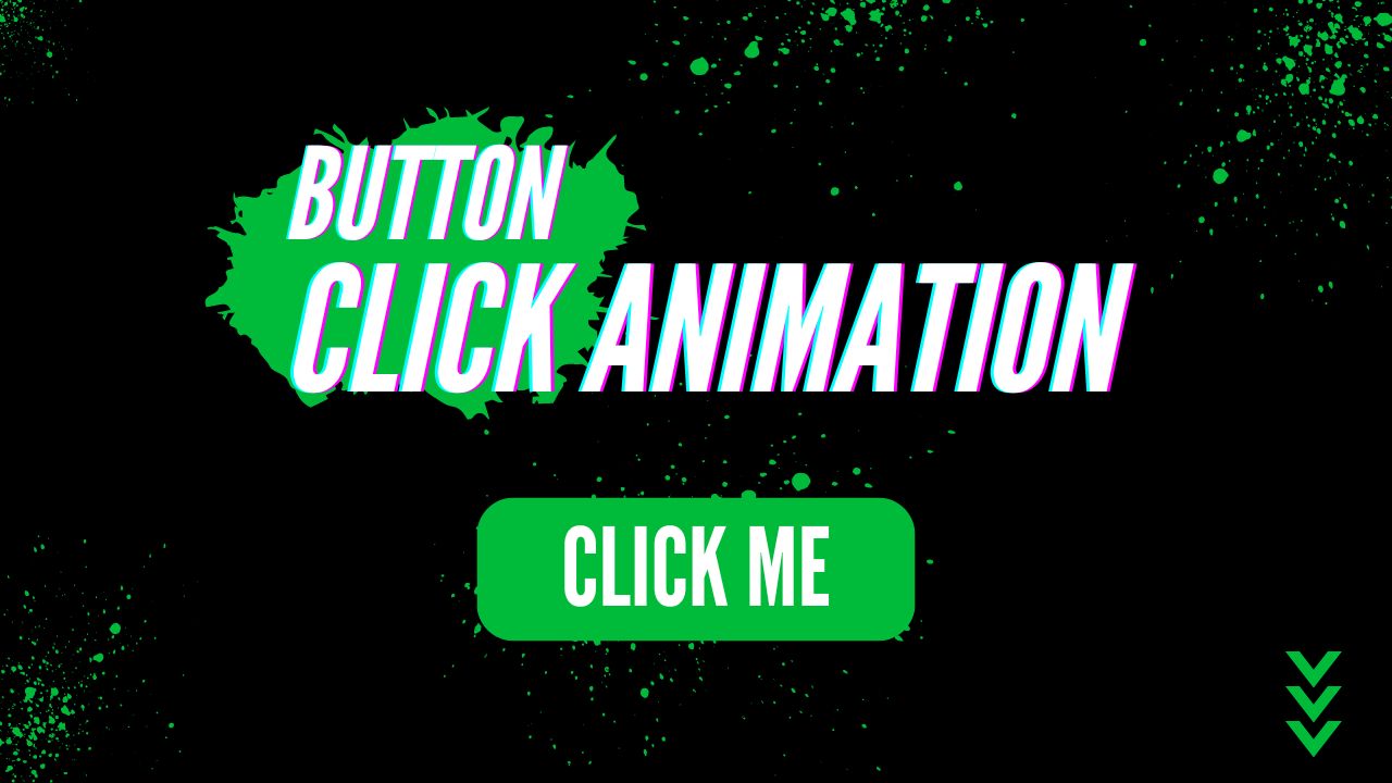
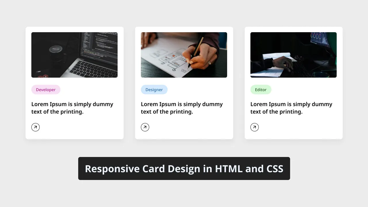
This blog post will demonstrate how to create a responsive design for cards using HTML and CSS. Three cards will be shown on screen, each featuring an image, title and button – plus an animated border animation when hovered over.
We will style and create responsive cards using HTML elements commonly found in card design, such as div A, image, heading, and CSS properties. The project should be straightforward, user-friendly, and able to comprehend and follow its steps.
How to create a responsive card using HTML and CSS
Follow these easy instructions to create a responsive card design using HTML and CSS:
- Create a folder and give it any name you like, placing all necessary files inside.
- Create an index.html file as your main document.
- Create a style.css file containing CSS code.
- The Images folder is in your project directory and contains images for your card project.
Add the following HTML code to your index.html file: This code includes essential HTML markups such as semantic tags such as div, image, and heading that help create our card design.
<!DOCTYPE html>
<html lang="en">
<head>
    <meta charset="UTF-8">
    <meta name="viewport" content="width=device-width, initial-scale=1.0">
    <title>Responsive Card Design HTML and CSS</title>
    <!-- Font Awesome Icons -->
    <link rel="stylesheet" href="https://cdnjs.cloudflare.com/ajax/libs/font-awesome/6.4.2/css/all.min.css">
    <!-- Custom CSS -->
    <link rel="stylesheet" href="style.css">
</head>
<body>
    <div>
        <a href="#">
            <img src="images/developer.jpg" alt="Card Image">
            <span>Developer</span>
            <h3>A "developer" codes software and websites.</h3>
            <div>
                <i></i>
            </div>
        </a>
        <a href="#">
            <img src="images/designer.jpg" alt="Card Image">
            <span>Designer</span>
            <h3>A "designer" is a design expert.</h3>
            <div>
                <i></i>
            </div>
        </a>
        <a href="#">
            <img src="images/editor.jpg" alt="Card Image">
            <span>Editor</span>
            <h3>An "editor" ensures content quality and accuracy.</h3>
            <div>
                <i></i>
            </div>
        </a>
    </div>
</body>
</html>
Add the CSS codes below to your style.css file to make your card responsive and stylish. To add an eye-catching finish, experiment with various CSS properties, such as fonts, colours, and backgrounds.
/* Importing Google font - Open Sans */
@import url('https://fonts.googleapis.com/css2?family=Open+Sans:wght@300;400;500;600;700&display=swap');
* {
    margin: 0;
    padding: 0;
    box-sizing: border-box;
    font-family: 'Open Sans', sans-serif;
}
body {
    background: #ecececdb;
}
.card-list {
    display: grid;
    grid-template-columns: repeat(auto-fill, minmax(300px, 1fr));
    max-width: 1250px;
    margin: 150px auto;
    padding: 20px;
    gap: 20px;
}
.card-list .card-item {
    background: #fff;
    padding: 26px;
    border-radius: 8px;
    box-shadow: 0px 5px 10px rgba(0, 0, 0, 0.04);
    list-style: none;
    cursor: pointer;
    text-decoration: none;
    border: 2px solid transparent;
    transition: border 0.5s ease;
}
.card-list .card-item:hover {
    border: 2px solid #000;
}
.card-list .card-item img {
    width: 100%;
    aspect-ratio: 16/9;
    border-radius: 8px;
    object-fit: cover;
}
.card-list span {
    display: inline-block;
    background: #F7DFF5;
    margin-top: 32px;
    padding: 8px 15px;
    font-size: 0.75rem;
    border-radius: 50px;
    font-weight: 600;
}
.card-list .developer {
    background-color: #F7DFF5;
    color: #B22485;
}
.card-list .designer {
    background-color: #d1e8ff;
    color: #2968a8;
}
.card-list .editor {
    background-color: #d6f8d6;
    color: #205c20;
}
.card-item h3 {
    color: #000;
    font-size: 1.438rem;
    margin-top: 28px;
    font-weight: 600;
}
.card-item .arrow {
    display: flex;
    align-items: center;
    justify-content: center;
    transform: rotate(-35deg);
    height: 40px;
    width: 40px;
    color: #000;
    border: 1px solid #000;
    border-radius: 50%;
    margin-top: 40px;
    transition: 0.2s ease;
}
.card-list .card-item:hover .arrow  {
    background: #000;
    color: #fff;
}
@media (max-width: 1200px) {
    .card-list .card-item {
        padding: 15px;
    }
}
@media screen and (max-width: 980px) {
    .card-list {
        margin: 0 auto;
    }
}
Conclusion. Final Thoughts and Conclusion.
Conclusion: Constructing responsive CSS cards enables web developers just starting out to use their HTML and CSS knowledge, putting it to the test in practice. I hope you have successfully created your CSS cards by following the code and steps in this article.
Create other functional website elements, such as login forms, navigation bars and homepages.
Clicking the Download button will allow you to access this project’s source code, while View Live gives a live demonstration.